Bay Area UC Admit Rates by County: Outliers, Trends, and What Best Predicts the Gap
A few numbers surprised us this cycle.
San Francisco County’s aggregate UC admit rate is 39.3% — the highest in the Bay Area. Marin’s is 31.5% — the lowest. That’s nearly an 8-percentage-point gap between two counties less than 25 miles apart, both with strong public school systems and well-resourced families.
But the county-level number is just the surface. When we dig deeper, we find that every county has schools that outperform their county average and schools that underperform it — sometimes dramatically.
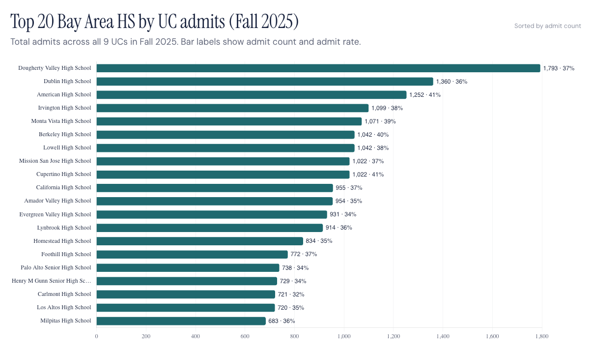
We pulled school-level admit rates from the UC Information Center for the most recent published cycle (UC publishes school-level data ~12 months after enrollment) for students who graduated from high school in 2025. Across 278 Bay Area public and charter high schools, 225 had 50 or more UC applicants and qualified for rate comparisons.
The full school-by-school dashboard is embedded near the bottom of this post.
This is about patterns, not cause and effect. We’re looking at trends in acceptance rates—we’re not saying a school made a student get in or not. Students ultimately control their own results. The data just shows the overall picture.
County summary: aggregate UC admit rate, plus rate by campus
The full 9-county × 9-campus breakdown for 2025:
| County | UCB | UCLA | UCSD | UCD | UCSB | UCI | UCSC | UCR | UCM | Aggregate |
|---|---|---|---|---|---|---|---|---|---|---|
| San Francisco | 13.7% | 8.1% | 24.9% | 39.6% | 28.5% | 25.8% | 71.3% | 91.1% | 96.2% | 39.3% |
| Napa | 13.3% | 8.6% | 27.3% | 42.4% | 30.0% | 2.3% | 67.8% | 90.1% | 96.2% | 37.6% |
| Alameda | 11.0% | 7.8% | 19.6% | 30.4% | 27.7% | 19.7% | 73.1% | 88.7% | 97.0% | 37.4% |
| Sonoma | 9.1% | 8.7% | 29.4% | 42.0% | 31.8% | 17.8% | 73.8% | 87.3% | 93.4% | 37.1% |
| Santa Clara | 10.9% | 8.4% | 17.3% | 25.6% | 32.6% | 20.0% | 75.1% | 90.8% | 97.9% | 36.1% |
| Solano | 6.9% | 8.3% | 22.6% | 34.5% | 36.6% | 6.1% | 74.8% | 86.5% | 95.6% | 35.6% |
| Contra Costa | 12.4% | 7.8% | 18.9% | 30.1% | 29.4% | 15.1% | 71.9% | 89.8% | 97.4% | 35.5% |
| San Mateo | 12.7% | 8.4% | 18.4% | 30.8% | 28.1% | 15.9% | 72.6% | 91.0% | 96.5% | 34.1% |
| Marin | 12.2% | 9.6% | 23.6% | 33.0% | 26.3% | 11.8% | 72.3% | 90.4% | 97.1% | 31.5% |
A few non-obvious patterns:
- UC Merced and UC Riverside admit roughly 9 in 10 applicants from every Bay Area county. Those two campuses are not highly selective at the county level anywhere in the Bay.
- UC Berkeley and UCLA are uniformly tough across the region. UCB rates range from 6.9% (Solano) to 13.7% (SF). UCLA hovers between 7.8% and 9.6%. The county doesn’t move those numbers much — they’re driven by individual student profiles, not geography.
- Marin’s UCLA rate (9.6%) is the highest among Bay Area counties. That’s worth remembering as you read the rest of this post — Marin doesn’t underperform at every UC; the overall difference shows up at UC Davis, UC Irvine, and UC Berkeley specifically.
- UC Irvine’s rates vary the most by county — 2.3% in Napa, 25.8% in San Francisco. Smaller applicant pools by county likely explain this swing.
Outliers: schools that beat or miss their county average
For every county, we identified the two schools furthest above the county aggregate rate and the two furthest below. (Schools with fewer than 50 UC applicants in 2025 are excluded)
| County | County Avg | Top Outlier (Above Avg) | Bottom Outlier (Below Avg) |
|---|---|---|---|
| San Francisco | 39.3% | Mission HS — 54.5% (+15.2pp) | Independence HS — 15.8% (−23.6pp) |
| Napa | 37.6% | Vintage HS — 40.4% (+2.7pp) | Saint Helena HS — 32.8% (−4.9pp) |
| Alameda | 37.4% | Oakland Charter HS — 50.5% (+13.1pp) | McClymonds HS — 6.2% (−31.2pp) |
| Sonoma | 37.1% | Sonoma Valley HS — 46.9% (+9.8pp) | Cloverdale HS — 22.6% (−14.4pp) |
| Santa Clara | 36.1% | James Lick HS — 51.3% (+15.2pp) | Milpitas Middle College — 18.6% (−17.5pp) |
| Solano | 35.6% | Vacaville HS — 42.0% (+6.2pp) | Griffin Academy — 25.8% (−10.0pp) |
| Contra Costa | 35.5% | Making Waves Academy — 44.7% (+9.2pp) | Invictus Academy — 8.9% (−26.5pp) |
| San Mateo | 34.1% | Summit Prep Charter — 41.5% (+7.4pp) | Tide Academy — 25.4% (−8.7pp) |
| Marin | 31.5% | Novato HS — 36.4% (+4.8pp) | Tamiscal HS — 22.7% (−8.8pp) |
Two patterns stand out:
The “above county average” outliers tend to be Title I schools, charter schools serving lower-income communities, and international/newcomer-focused schools. Mission HS in SF, Oakland Charter, James Lick (East Side Union), Making Waves Academy in Richmond, Aspire Lionel Wilson in Oakland, San Francisco International — all of these serve student populations where UC’s holistic review framework explicitly weighs school context, family income, and first-generation status.
The “below county average” outliers tend to be alternative, continuation, independent-study, or new schools. Independence (SFUSD continuation), Tamiscal (Tam Union independent-study), Tide (less than a year old), Invictus, Milpitas Middle College — these are not traditional comprehensive high schools, and their admit rates reflect program design and applicant-pool composition, not the academic strength of any individual student.
If you only read the bottom of the list as “weak schools,” you misread the data. Several of these are programs designed for students on different paths.
Which way of grouping schools best predicts the gap?
A natural question: which type of school consistently outperforms the average, and which underperforms? We tested three different groupings to see which has the strongest correlation with admit rate.
| Grouping | What We Tested | R² (Variance Explained) |
|---|---|---|
| Demographic / Program Type | Comprehensive public, charter, magnet/specialty, alternative/continuation | 0.085 |
| Size + Selectivity Proxy (log of UC applicants) | Smaller schools tend to be more variable | 0.010 |
| District / Region | Aggregate rate by school district (≥3 qualifying schools) | 0.166 |
School district is roughly twice as strong a predictor as program type, and ~17× stronger than size. Of the three lenses, the district a school belongs to explains the most variance in its UC admit rate. Districts are bundles of demographic mix, course catalogs, college-counseling resources, neighborhood context, and student composition. So “where a school sits” predicts its rate better than “what type of school it is” or “how big it is.”
The top and bottom districts:
Highest aggregate UC admit rate by district: - San Francisco Unified — 39.3% (16 schools) - Fremont Unified (Alameda) — 38.8% (6 schools) - Hayward Unified — 38.7% (5 schools) - San Lorenzo Unified — 38.5% (3 schools) - Napa Valley Unified — 38.4% (4 schools)
Lowest aggregate UC admit rate by district: - Tamalpais Union High (Marin) — 30.5% (4 schools) - Sequoia Union High (Peninsula) — 32.1% (8 schools) - Acalanes Union High (Lamorinda) — 33.0% (4 schools) - Vallejo City Unified — 34.0% (4 schools) - Liberty Union High (East Contra Costa) — 34.1% (3 schools) - Palo Alto Unified — 34.3% (3 schools) - San Mateo Union High — 34.7% (7 schools)
The bottom of the list contains some of the most academically reputable, well-resourced public school districts in California — Tamalpais Union, Acalanes, Palo Alto Unified, San Mateo Union, Sequoia Union. The top of the list is dominated by districts with higher proportions of first-generation, lower-income, and English-learner students.
That’s the post-Prop 209 holistic review framework playing out. It is not a statement that students from Acalanes are “weaker” than students from Hayward Unified — applicant pools differ, course offerings aren’t consistent, and individual outcomes vary widely. At the district level, the pattern of who gets admitted looks different from what you’d expect based on typical school rankings. The system UC created after California Proposition 209 is the most likely reason we found for this.
What changed from 2019 to 2025?
Bay Area UC admits grew roughly 60% over the period. But the rate of growth wasn’t even.
Top 10 climbers (rate change from 2019 → 2025):
| School | County | 2019 | 2025 | Change |
|---|---|---|---|---|
| MetWest HS | Alameda | 4.7% | 43.1% | +38.4pp |
| Arise HS | Alameda | 8.5% | 40.0% | +31.5pp |
| Aspire Lionel Wilson Coll Prep | Alameda | 17.6% | 48.3% | +30.7pp |
| Castlemont HS | Alameda | 3.4% | 31.8% | +28.4pp |
| Mission HS | San Francisco | 27.4% | 54.5% | +27.1pp |
| Oakland Charter HS | Alameda | 23.9% | 50.5% | +26.6pp |
| Oakland International HS | Alameda | 10.2% | 36.7% | +26.5pp |
| Dozier-Libbey Medical HS | Contra Costa | 16.7% | 43.1% | +26.4pp |
| Oceana HS | San Mateo | 14.4% | 40.5% | +26.1pp |
| SF International HS | San Francisco | 23.9% | 49.1% | +25.2pp |
Top 10 decliners:
| School | County | 2019 | 2025 | Change |
|---|---|---|---|---|
| Life Academy HS | Alameda | 51.0% | 37.3% | −13.7pp |
| Terra Nova HS | San Mateo | 38.2% | 28.9% | −9.3pp |
| Terra Linda HS | Marin | 40.3% | 33.9% | −6.4pp |
| Adrian C Wilcox HS | Santa Clara | 39.1% | 32.7% | −6.4pp |
| Oakland Military Inst College Prep | Alameda | 31.0% | 24.8% | −6.2pp |
| Liberty HS | Contra Costa | 37.9% | 31.8% | −6.1pp |
| Antioch HS | Contra Costa | 40.4% | 34.9% | −5.5pp |
| Ruth Asawa School of the Arts | San Francisco | 43.5% | 38.3% | −5.2pp |
| Santa Rosa HS | Sonoma | 36.4% | 31.8% | −4.6pp |
| Dixon HS | Solano | 33.5% | 29.8% | −3.7pp |
The climber list is striking: every one of the top 10 is a Title I, international/newcomer-focused, or charter school serving lower-income communities — clustered overwhelmingly in Oakland, San Francisco, and Richmond. Higher admission rates tend to show up in the same districts that already have the highest overall admission rates in 2025.
The decliner list is more mixed but skews toward schools whose 2019 rates were already at the high end and have drifted toward the regional median. Three of the top decliners (Terra Nova, Terra Linda, Liberty) come from districts now sitting in the bottom-rate group above.
What this means for families
The overall UC admission rate at your student’s school can be helpful—but only if you interpret it the right way.
District matters more than school type or school size. Two comprehensive public high schools in different districts can produce very different aggregate rates for reasons that have far more to do with applicant pool composition and how UC reads the school’s context than with the schools themselves.
Outliers within a county tell you more than the county average. Mission HS sitting 15 points above SF’s average and Independence HS sitting 24 points below it is a much more useful description of the SF landscape than “39.3%” alone.
Trend direction matters. A school whose rate climbed 25+ points since 2019 is a different story than one whose rate dropped 5 points. Both might be in your zip code. Take a look at the dashboard below.
What it doesn’t mean: the rate decides your outcome. UC looks at each student individually. School context is just one of many factors—UC Berkeley lists 13 in its review process. It’s something they consider, not the final decision maker.
A few final comments
Numbers matter. A school with 50 applicants and a 50% rate is not statistically equivalent to a school with 600 applicants and a 50% rate. Treat smaller-school numbers as rough estimates. The dashboard shows the denominator alongside every rate — review it.
Private schools are largely missing. UC doesn’t report data for schools with fewer than 5 applicants, which affects small private schools the most. Aggregate private-school admit rates are reported separately by the SF Chronicle’s private-school feature. Our dataset only includes public and charter schools.
Program type influences the rate. Continuation, alternative, independent-study, and brand-new schools can sit at the top or bottom of the rankings for reasons unrelated to academic preparation.
Correlation isn’t causation. This post is only showing patterns in the published data. Each student’s outcome depends on their own application, their choices, and a review process that considers context.
Explore the full dataset
Every school, every UC campus, every year from 2019 to 2025 — filterable by county, city, and school — is in the dashboard page.
Ready to build your student’s plan?
StrivePath offers personalized academic and college advising for Bay Area students from 7th grade through senior year. Book a free consultation with our team today.
👉 mystrivepath.com: StrivePath: Happier students. Less stressed families. Better admission outcomes.
This Thursday (5/7), we open a 6-week regional series — starting with the policy framework that explains why the rates differ, and walking through every Bay Area region by name from 5/14 through 6/18.
Sources: UC Information Center — Admissions by Source School; UC Berkeley Office of Planning & Analysis; SF Chronicle — Bay Area Private Schools; StrivePath analysis of 225 qualifying Bay Area public and charter high schools (≥50 UC applicants), 2019 and 2025 cohorts, pulled from UC Infocenter.